Table of Contents and Drafts of Table of Contents
CONVENTIONS OF TABLE OF CONTENTS FOR LIFESTYLE MAGAZINES
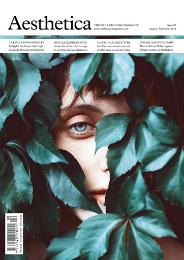
It is common in lifestyle magazines to have a spread of two pages displaying what is to be presented in the magazine. Generally, the spread has a feature, like a white border on a gray page or text boxes to organize the information, that keeps the entire table of contents clean and make it easy to follow, while still looking sophisticated. Furthermore, the main cover lines that are shown on the cover or that have the most importance are often bolded or created bigger than the other article titles to show its relevance in this edition of the magazine. The color scheme is commonly different shades and tints of one color, used in different areas. This one color is normally bright and bold and used as an accent color, like the use of red in the following image.

The layout is either a scattered look, to make the table of contents more intriguing, or a list-type display of the articles and images in the magazine.
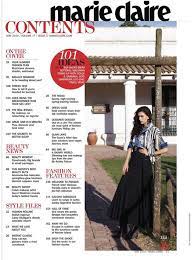

There are normally 1-2 main, bigger images used in the table of contents for the main articles, as stated above, but a few smaller photos can also be used on the page or the spread to add to the scattered layout and appearance. Because the layout is the first thing seen by the viewer before they begin to read the information, the placement of the images and larger texts accentuates the way the rest of the magazine is written, and how lifestyle magazines are meant to be used as a guide to relax and live one’s best life.
TABLE OF CONTENTS DRAFTS AND EXPLANATIONS
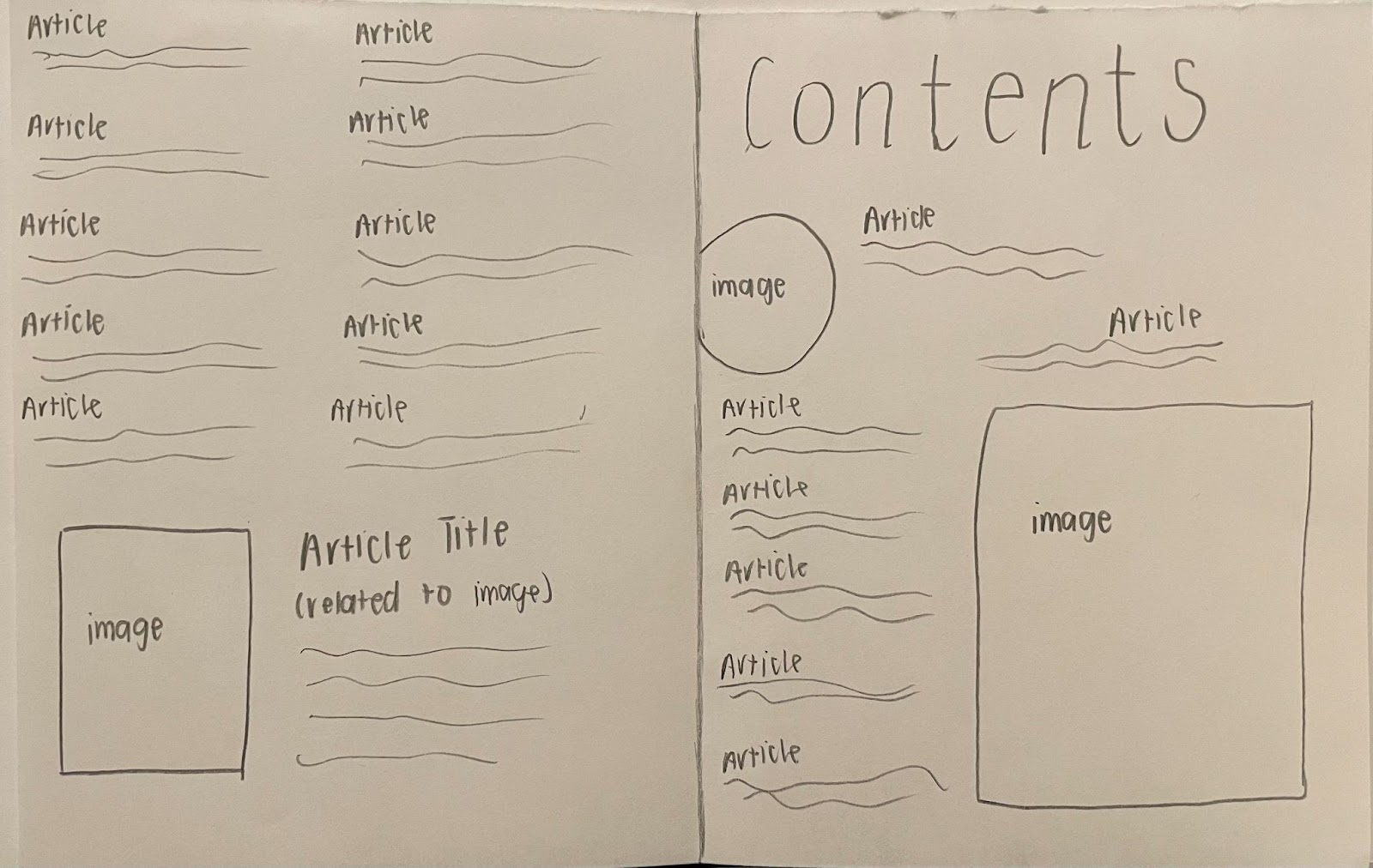
Because the cover has warm tones of brown and beige, the table of contents should mimic the same idea. The article titles would be a darker shade of brown, while the “contents” would be dark,too, just slightly lighter to add variation. The images should also feature similar colors, in order to not create clashing color schemes. For the fonts of all the text, the font family of Modern San Serif would be used because it sends the message of it being elegant, chic, and artistic. The images would be related to the big article title and a few other smaller articles provided in the magazine. The layout of the table of contents is a list in a few areas, like on the left page and having the articles wrap around the image, and slightly scattered on the right page in order to create a more interesting scene. This layout combines elements from both common layouts of lifestyle magazine table of contents.

The color scheme would be similar to the last mockup of the table of contents, with the elements of brown, as it is used in my cover numerous times and the main image on the cover has beiges and browns. However, this cover would have more light shades instead of dark browns, and would have a wite border. Borders are common in lifestyle magazines and are a convention that add brightness to a page and lighten up the information on the page. The same font family of Modern San Serif would be used in order to display the same messages about the magazine, and how it is elevated and sophisticated, while still being expressive of art and happiness in life. There would be two main article titles that would be bigger and bolder than the rest, that would connect to the two main, big images shown, while the rest are small and can relate to any other article titles shown on the spread. This layout projects more ideas of the scattered look, by having elements placed in less geometric designs, and more filling the space, while not overcrowding it. The use of the circles for headlines also adds to this idea of a layout because it creates an even and complementary scene to the cover.
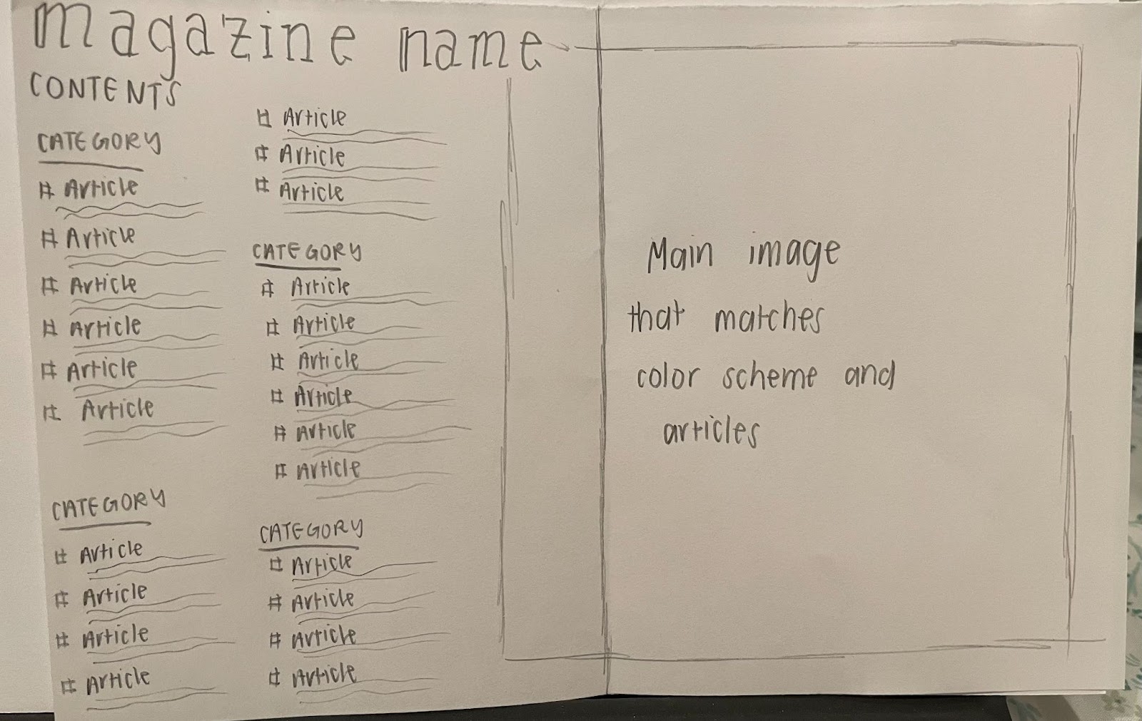
In this table of contents drawing, browns and neutral tones can still be used to tie it back to the cover, but for the magazine name, an accent color that would complement the neutral tones should be used. A color like navy blue would add more than just brown to the page, while not using colors that clash. Again, I believe fonts from the font family Modern San Serif should be used in order to express the same ideas to the viewer about the magazine and create larger profits from the magazine. The image would relate to a similar idea projected on the cover, to create a cohesive idea, but it will not be the same image because then it will cause repetition and remove the viewer’s interest. The layout of this spread for the table of contents is more like the list idea, where everything is well organized and the image is separated from the text more than the other drafts. The page numbers are on the left of the article titles, and it will be read from up to down, and then go to the next column of article titles and categories of lifestyle.
Some article ideas would be the ones displayed on the cover, like food joints that are healthy, how to maintain a plant-based diet, and yoga poses to relieve the mind, but I also want to include some articles on mental health and physical exercises.
I am leaning towards the second table of contents spread because it combines both layouts that are parts of lifestyle magazine conventions of having a spread-out, more scattered look and having a list and printing out all the article titles straight up. It purposefully challenges the conventions to create an even mix and a table of contents that is sure to grasp the attention of the viewers.

Comments
Post a Comment