Color Theory
WHAT IS COLOR THEORY?
Color theory is using science and art in order to create a visually appealing scene of colors. It also includes how colors are paired together, and how the human eye sees it and takes it in. Color theory can generally be guided by using a color wheel, or a display of all the colors and what happens when you mix certain colors, in order to get an idea of what colors go together and cause an interesting effect. Nowadays, some apps show which colors can draw attention to the viewer of publications and how different colors affect different moods and reactions. Color theory also includes the lightness and darkness of colors and how it determines what other colors can go with it.
COLOR COMBINATIONS
There are many color combinations that we commonly see through everyday life, but may not notice. For example, one of the most common combinations is the primary colors- red, blue, and yellow. These colors are able to create all the other colors that we see by first being able to create secondary colors, and then the more complex shades and tints we see.
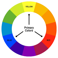
Another common color combination is the secondary colors- orange, purple, amf green. Orange is created by mixing red and yellow, purple is created by mixing blue and red, and green is created by mixing blue and yellow.

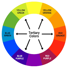
The next color combination is the tertiary colors- yellow green, yellow orange, red orange, red purple, blue purple, and blue green. These colors are created by mixing one primary color and one secondary color, to give a more complex color that is less common than the other colors on the color wheel.
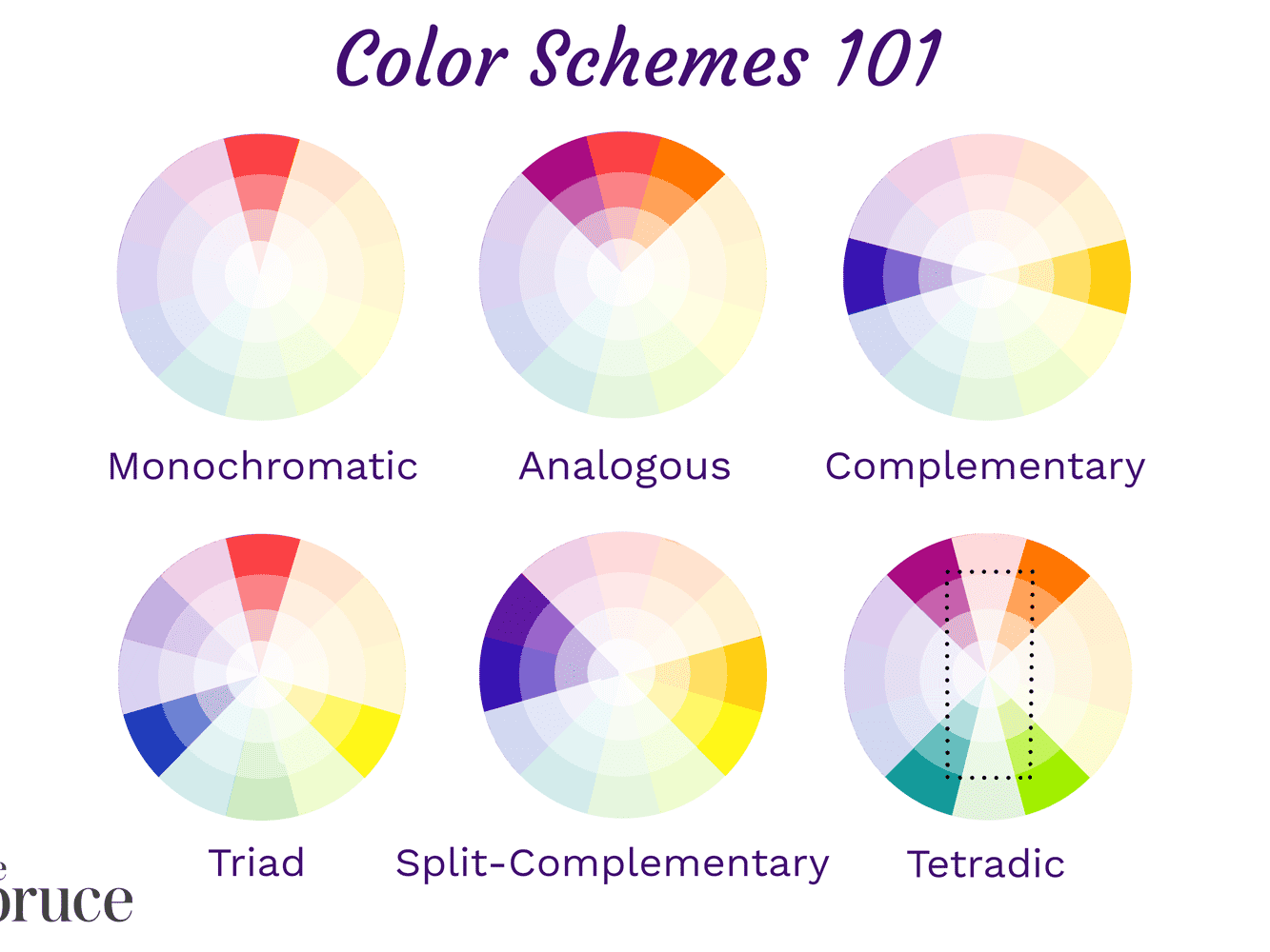
There are also other color combinations, such as analogous colors, which are three colors that are right next to each other on the color wheel, and complementary colors, which are colors that are across from each other on the color wheel, and monochromatic colors, which are just shades and tints of the same hue/color. There are also cool- blue, green, and purple- and warm colors- red, yellow, and orange.
TIPS WHEN DESIGNING WITH COLOR
When designing with colors, there are many resources that can be accessed very easily that can help you have hues that go together well. For example, the Canva color wheel (https://www.canva.com/colors/color-wheel/ ) uses color theory and displays many colors with their shades and tints in order to give a visual showing of how colors may look and if that is what is appropriate for what someone might need them for. There is a built-in color calculator on the Canva color wheel that shows the color combination being used and how you can explore what you feel is best for your use. The Adobe color wheel is also another source that has the same purpose and can help.
When designing, using tints and shades of a color that appears often allows for more viarition to the viewer and creates a more interesting scene. By using one of the many color combinations that we have, a piece can be created that is cohesive and still intriguing to look at.
COLOR PSYCHOLOGY
Each color has the ability to spark emotions from the viewer and create a set tone to the contents around it. The color red can stimulate love, anger, power, and passion. Orange can spark attention, enthusiasm, happiness, and energy. Yellow can show warth, brightness, energy, and attention. Green can stimulate nature, safety, envy, and luck. Blue can show productivity, sadness, calness, and stability. Purple can spark mystery, wealth, royalty, and imagination. Pink can show calmness, romance, kindness, and nurturing. Brown can spark nature, isolation, security, and strength. Black can stimulate mystery, unhappiness, boldness, and power. And lastly, white can show peace, innocence, happiness, and cleanliness.
COLOR PSYCHOLOGY USED IN MEDIA
Magazines are, of course, an industry on their own. This causes many magazines and cover designers to want to use colors that are going to spark some feelings to the audience in order to get them to buy that issue or subscription to that magazine.
Even companies that need to market something use color psychology to help. For example, the company Coca-Cola has used the color red in order to create a fermiaitly to the audience when they see thos cn of soda. The color choice of the red and white allo for a bold and fierce color and a mellow and cool color to work together in order to create a simple, yet stylish can of soda.
COLOR PSYCHOLOGY IN LIFESTYLE MAGAZINES
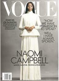
As shown in this VOGUE magazine cover, there is the use of white and gray shades of white. This magazine shows a level of elegance and calness by using these colors, as well as using the black for the font of what will be in the magazine and its contents to provide a sense of mystery to the audience to get them to purchase this magazine.
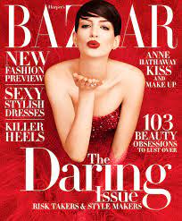
As shown in this Bazaar magazine is the use of a LOT of red. This hue being the entire main image of the magazine creates a sense of boldness to the women in the dress, therefore showing power and establishing her place in society or in an industry. The white on top of the red tones down the intensity of the cover, and allows for the viewer’s eyes to be drawn to the words and content displayed on the magazine cover.
In lifestyle magazines, there is a huge range of what colors might appear on the covers and inside the magazines themselves because of how different magazine companies want to carry their brand, as shown in the two examples above. VOGUE created a simple and elegant design by focusing on shades and tints of the colors black and white, while Bazaar used one extremely bold color and one calm color in order to create a balance of colors that is automatically eye-catching.
To conclude, color psychology is the use of colors and variations of those colors in order to design something that carries different emotions that can be portrayed to the audience in many ways. Color combinations are a big way of knowing which hues will look together and which ones can deliver certain messages to the viewers. Many companies use color psychology for marketing purposes and to create a name for their brand. Colors are very apparent in lifestyle magazines, and allow for us to be able to see them and have an impact on how our brain processes them. After all, our brain controls what we do!
SOURCES USED
100 Color Combination Ideas and Examples | CANVA. https://www.canva.com/learn/100-color-combinations/.
Chathurika, Harshani. “Analogous Colors and Color Wheel.” Medium, UX Planet, 17 Apr. 2019, https://uxplanet.org/analogous-colors-and-color-wheel-609a05b5b90e.
Cherry, Kendra. “Can Color Affect Your Mood and Behavior?” Verywell Mind, Verywell Mind, 28 May 2020, https://www.verywellmind.com/color-psychology-2795824.
“Color Wheel - Color Theory and Calculator | Canva Colors.” Canva, https://www.canva.com/colors/color-wheel/.
“Primary Colors.” Encyclopædia Britannica, Encyclopædia Britannica, Inc., https://www.britannica.com/science/primary-color.

Comments
Post a Comment