Conventions of Art Magazines
Art magazines have created a big market for themselves. They are a publication that focuses primarily on art and the artists that created an idea and story for the viewers to understand. Creating an art magazine involves a lot of research of the current events in the art world, such as current shows and museums, and being able to analyze the classic art pieces that are seen as a staple in this industry.
Art magazines can display information about the art market, art history, art criticism, news, how to practice art, and the politics tied to art. Because art contains so many subdivisions and new and expressive forms, these magazines can supply knowledge about any of them.
In order for an art magazine to stay relevant, it must include photographs. Photos of artwork or artists working display a visual aspect that allows the reader to comprehend the information written in the magazine easier. Although art magazines seem like they would have photographs to document works, some writers, who are also artists, include their own sketches and handwritten notes into articles.


We can deeply analyze the cover from the Artist's Magazine titled “All My Love”. The masthead, which is the name of the magazine which is generally in its typical font in order to create an image for that publication when readers want to recognize it, is “Artist’s Magazine” in this case, and as shown in both of the Artist’s Magazines the same font and dot on the “i” is used as a marketing strategy, while the colors and fonts of the other titles and coverlines changes according to the main image. The main image is displayed as a background and the other words and titles are placed in front of it. Because the main image is so bright and colorful- as it is displaying a piece of historic art- the other colors of the fonts used are more calm and neutral to not take away from the main image on the cover. There are also cover lines on the cover, such as “Painterly Skies, Satin Drapes and Red-Carpet Entrances”, right under the title of the article that is written in the magazine. The coverline serves the purpose of a teaser of what content will appear in the magazine, similar to a trailer for a movie. There is also a line appearing on the cover of the blue magazine under the title, and it says “All New!”, which is a big marketing strategy used in the industry of print to show the audience why they should purchase this magazine issue. Through the coverlins and titles of articles with their page numbers displayed on their covers, it is shown that the magazine will cover the topics of famous artists from history, the uses and ideas that are related to the color blue, some home inspiration, and projects/ tutorials that the reader can follow. These articles that are mentioned on the cover are most likely spreads, or two pages that are put side-by-side but used to create one unit, in order to display works of art in the articles and be able to explain and scribe them to the reader at the same time.
Magazine covers can also display who might be more likely to purchase the magazine constructed from the contents. Based of the magazine cover of the Artist’s Magazine called “Art of Theater'', the target audience that is projected must be those that are interested in reading about the artworks that show the meaning of other, more interpretive forms of art, and there are many tutorial explanations shown of the cover of this magazine, as well so it is also targeting those that want to learn. In the magazine called “The Art of Watercolour '', the target audnecr is definitely those who enjoy using watercolor as a material to create art, and see the works and explanation behind other watercolor painters’ work.
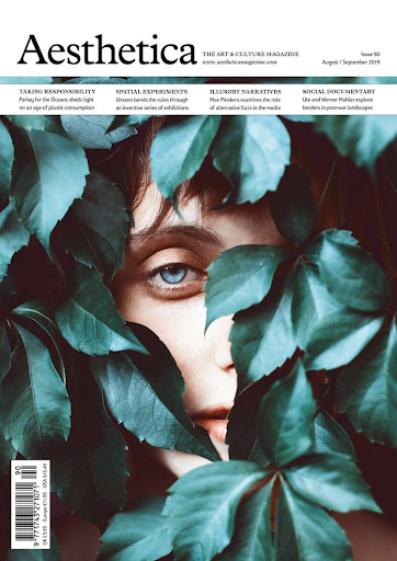
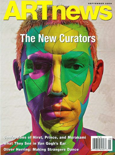
As shown in these photos of famous art magazine covers, they all use images or art creations that grasp attention very quickly. The contents of these magazines, such as the masthead and the cover image, all go well together in order to have an aesthetically pleasing view. For example, for the cover of the Art News magazine, the main image is extremely bright and directs the audience’s attention immediately, while the article titles and the masthead are white and yellow to provide visual contrast. The magazines show some of the articles through cover lines that are either the same or a similar font to the rest of the cover or are colors that contrast, yet compliment the main work shown.
The main focus of art magazines is to display the creativity and thought that is necessary to compose or interact with art and artworks. They allow for those who may not always be able to go visit an exhibition or museum to experience the feelings that many have tied with art through analyzing pieces and just simply letting them be shown to more people in the world. Art magazines have many technical elements, like the masthead, coverlines, or the titles of the articles located on the front cover, but also let the audience get to learn and view more about art. They let artists really explore more art forms, as there are so many available to the world!
Sources Used:
Phillpot, Clive. “Art Magazines and Magazine Art.” The Online Edition of Artforum International Magazine, 1 Feb. 1980, https://www.artforum.com/print/198002/art-magazines-and-magazine-art-35840.
Cavaluzzo, Alexander. “Thinking of Magazines as Art Objects.” Hyperallergic, 19 Sept. 2011, https://hyperallergic.com/33648/thinking-of-magazines-as-art-objects/.

Comments
Post a Comment