Cover Photo Editing and Selection
In order to create a cover that draws in a large audience and can allow for a magazine to sell, the main image is generally edited and refined before put into printing. To edit the photos I chose, I decided to use Canva, as it is easy to access and use. There are many pre-made filters and tools that make it simple to edit photos. With these photos, I am trying to accomplish the idea that having a healthy lifestyle (as this is to be part of a lifestyle magazine) does not have to be superbly complex, and it can start with simple ways, being shown with the pure lighting and editing. It purposefully subverts the conventions of lifestyle magazines, as they are very staged looking, but still have the idea of looking simple and elegant. With these cover photos, I chose for them to not look as staged, and more natural, to reveal the idea of a true lifestyle and how it may change for everyone.
COVER PHOTO EDITING
For my first cover photo, I opened a new page on Canva and uploaded my original image onto the page (as shown above).

I then used the premade filter on Canva, called “Epic” in order to saturate the image a little more, without taking away too much of the natural white on the countertop and making it yellow.
I was contemplating whether or not to remove the background for this image, but based on the conventions of lifestyle magazines, there is always a background that allows for the shadows of the main subject to appear and seem more real than not having a background itself.

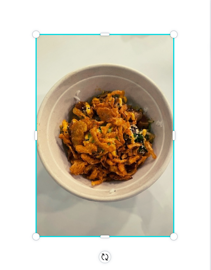
For my second cover image, I repeated the same process of uploading the photo onto a blank page on Canva, and it is here above.

Then, I used the premade filter on Canva called “Cali '' in order to increase the vibrance of the fruits and vegetables, while still showing the natural hues and tones of the colors.
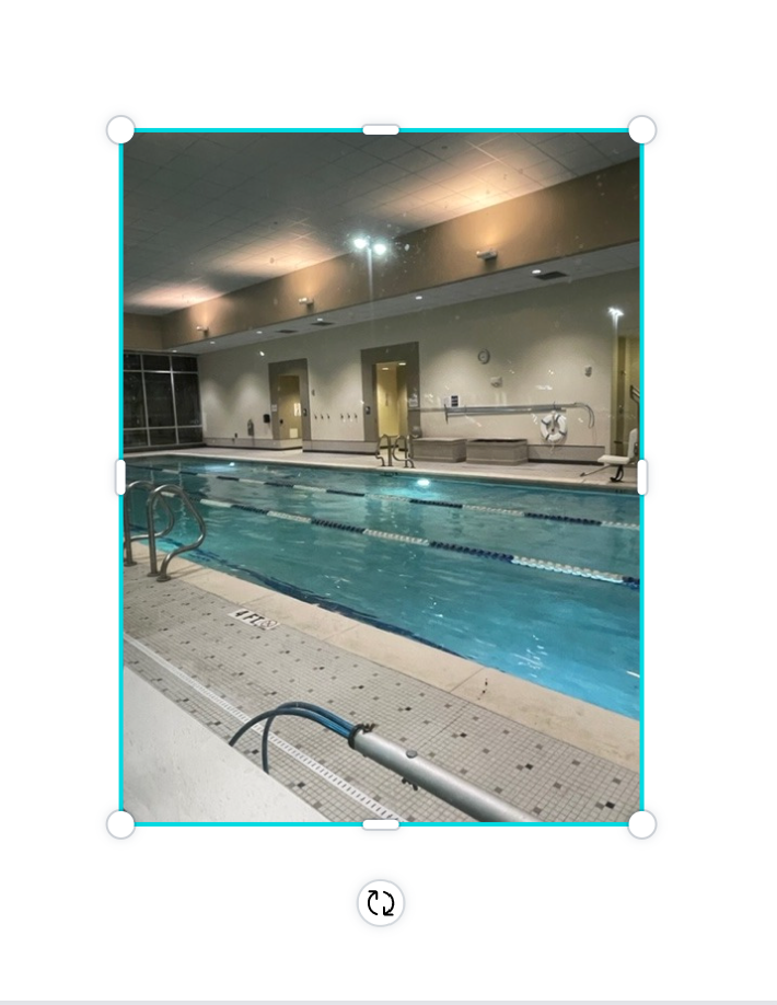
For my third and last cover image, I repeated the same process on Canva.
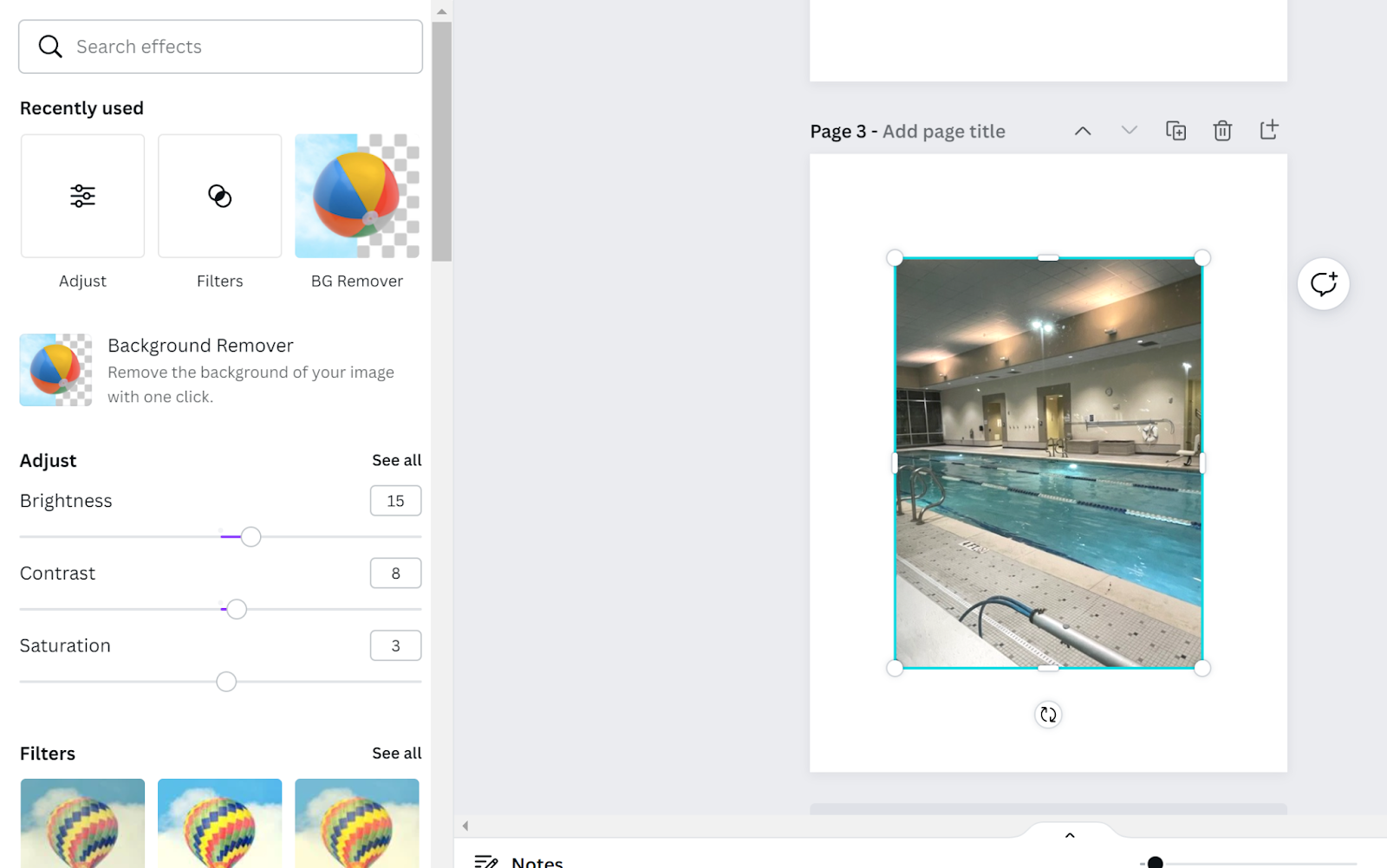
Instead of using a premade filter for this image, I used the sliding bars for the brightness, contrast, and saturation to slightly alter the color and lighting in this photo. I increased the brightness by 15, increased the contrast by 6, and increased the saturation by 3. I only used small amounts of each because when a photo has too much of one of the elements, it may look unprofessional and not as elegant.

Finally, I used a filter under the category of “ColorMix” called Glow in order to reveal a nighttime-looking scene and to make the idea presented in the image feel natural and relaxing.
For the last two cover images, I did not remove the background because both photos had so much going on to begin with, and there simply was no background that could be removed and still have the photo looking natural.
In the process of editing and selecting photos for the cover of the magazine, I enjoyed being able to see how different filters and ideas in editing can be used in order to give different feelings and emotions to the viewer. I did not like how Canva did not have some intricate ways of editing the photos, so if I were to do something differently, I would use a different platform after to alter the photo in smaller ways than just having a filter or background remover. Overall, the editing cycle allowed for me to change the photos to fit into the conventions of lifestyle magazines, while still being unique in its own way.

Comments
Post a Comment