Table of Contents and Images with Editing
In a table of contents for lifestyle magazines, it is normally either a simple list of coverlines and organized images, or more scattered, with the coverlines and images all over the place. For my table of contents, I chose to create a mixture of a list and scattered layout, so these photos below have been edited in order to better fit the design.
TABLE OF CONTENTS PHOTOS TAKEN
The photos shown below are the original photos I took that I would like to potentially use in the table of contents. Three out of the 5 photos are off locations in Colorado, and I am using these photos because they can show the lifestyle/travel aspect of the content the magazine should provide, while still having neutral color schemes like the rest of the magazine. The image of the produce on the shelves will definitely be featured because it clearly relates to one of the articles I wanted to include in the table of contents. The second photo (in the first row on the right) did not make the cut, but is still included because it was a nice photo that I was thinking about adding, but it does not match the theme, and I do not have as many variations of the photo if it were to be in an article.


EDITING PROCESS OF PHOTOS

Above is the original photo in the website Canva, which is what I used to edit my photos.
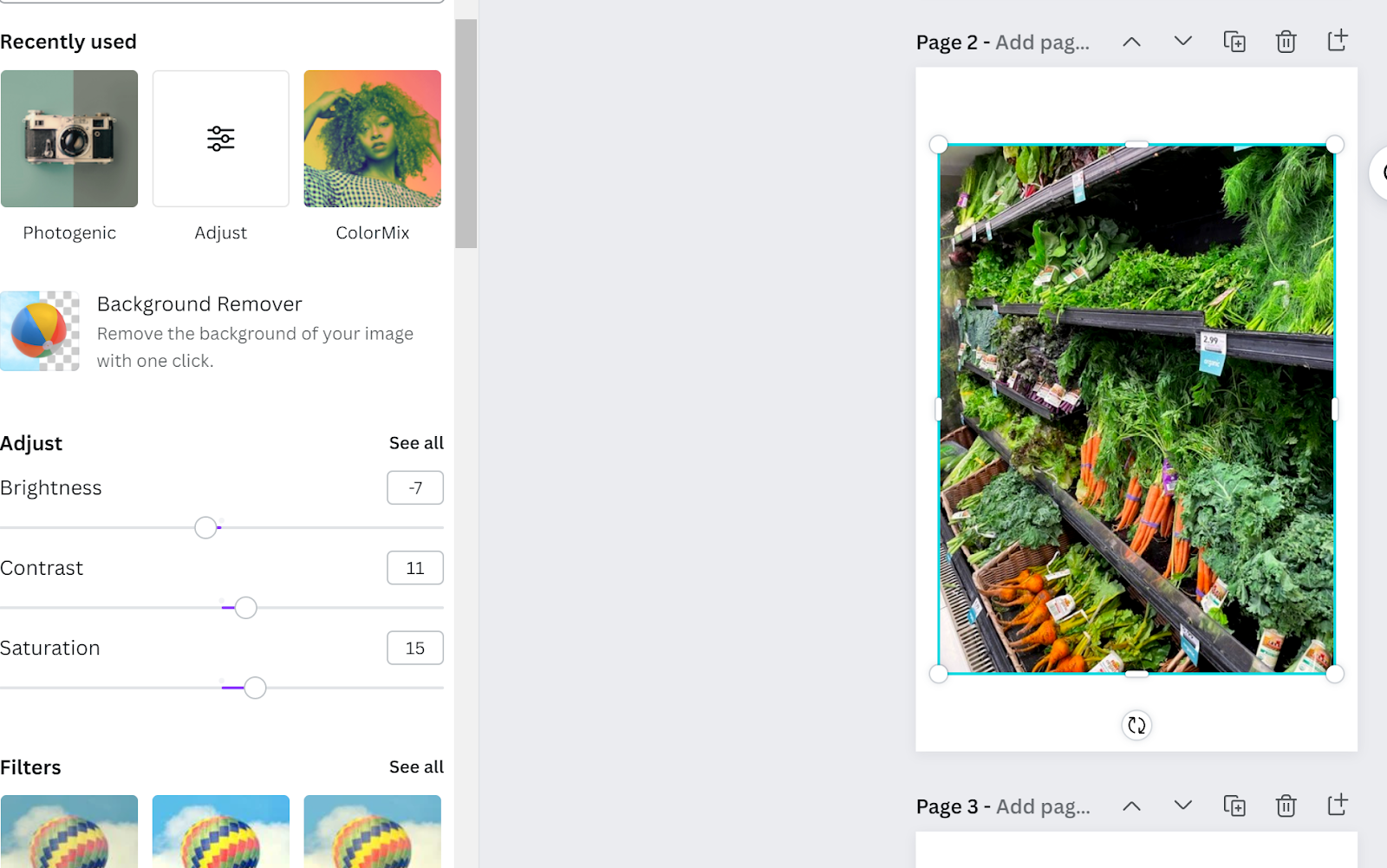
First, I changed the contrast to 11, in order to extenuate the brightness of the vibrant colors to begin with, and changed the saturation to 15 for the same reason. However, when I saw the photo after these two changes, I noticed the food looked very fake, and I did not want that to be the outcome, so I turned the brightness down to -7 in order to balance out the contrast and saturation, while not taking away from the bright colors.

This is the original photo in Canva, just like the other photos I used.

Then, I slightly changed the adjustable factors. I changed the brightness to 5, in order to bring out the blue sky more and make it contrast better with the brown buildings. I changed the contrast to 6 for the same reason, and then made the saturation 10 in order to make the water color seem more alive instead of looking dull and almost dead.

Lastly, I placed a filter over the photo with the adjustments of the brightness, contrast, and saturation called “Summer” in order to remove the extra white in the photo and give in a more calm, surreal look that still had vibrant colors.

Here is another photo I edited using Canva (the original).
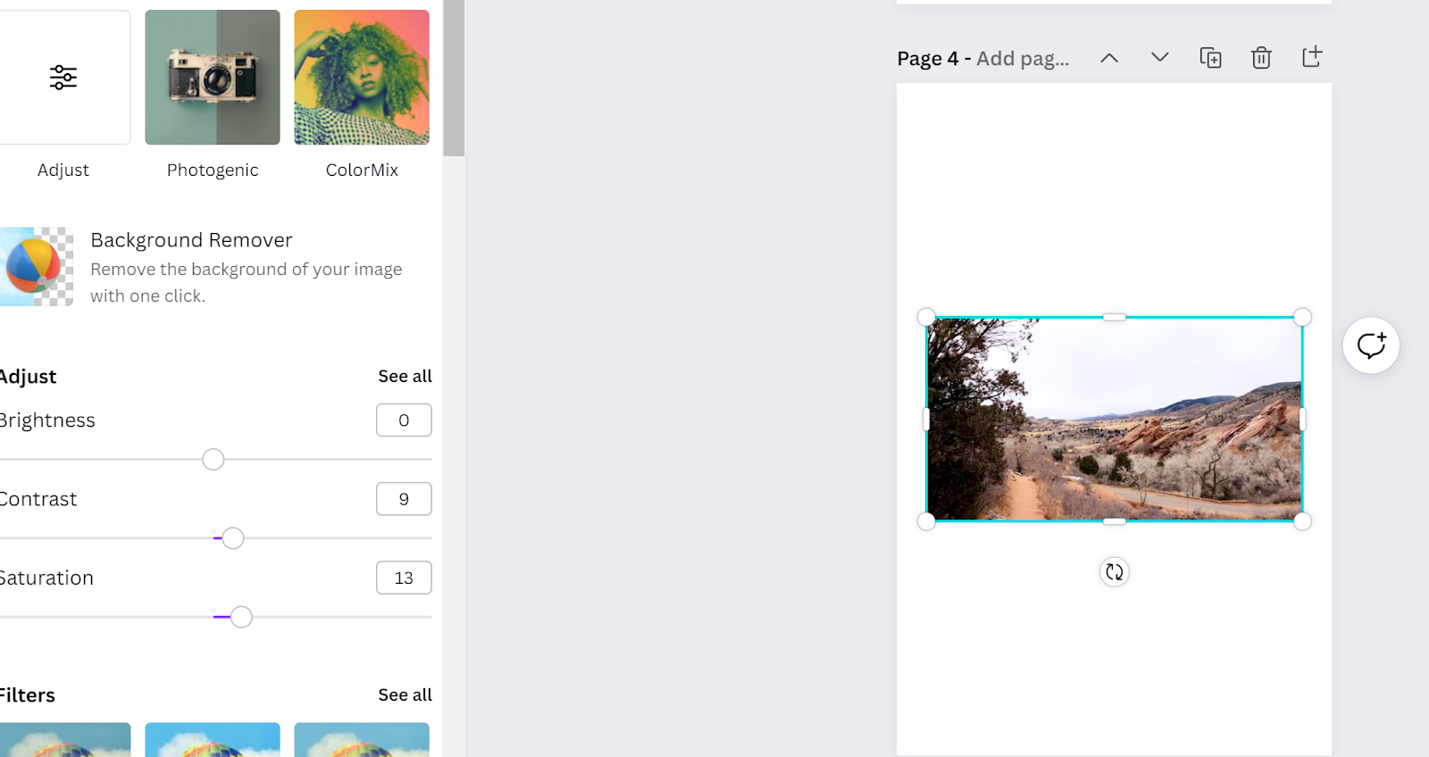
For this photo, I just simply changed the brightness, contrast, and saturation because I already like the natural colors and tints/shades of those colors that appeared in this photo. I changed the contrast to 9 and the saturation to 13 in order to give the scene more life, and just make the photo more appealing to look at in general.

Here is the last photo I edited for the table of contents, on the Canva website.

I changed the brightness to 18, the contrast to 8, and the saturation to 12 in order to take away from the fact that the light source is behind the mountains, so doing this helped make the picture brighter in general.

Lastly, I added a filter called “Cali” that has hints of yellow and white in order to give the photo a finishing touch and not have a super white photo.
ARTICLE TITLES
In lifestyle magazines, different categories are very common, so the articles are also written about different topics, such as traveling or food. A few article titles I want to include in my table of contents are the ones on my cover, talking about “Maintaining a Plant-Based Diet” and “Health Food Joints”, but also other articles. Here is a list below:
Maintaining a Plant-Based Diet: The foods you should be eating, and the ones to avoid in order to leave your body stronger and healthier
Healthy Habits for Better Sleep: These tips and tricks and will change how you sleep forever
Ways to Increase Positivity in the Mind, and Decrease Negativity
Vacations that Will Forever Connect You with Nature: Who knew nature was so great?! Discover the new and upcoming spots that are scenic and soothing
Colorado: A State of Hikes and Views
How to Dress for the New Season of Spring
In the genre of lifestyle magazines, article descriptors are not as common, but I want to include them in order to fill up the spread of the table of contents more. The article descriptors are put behind the article names above for the ones that are more featured than the other articles.
The voice and tone for the article descriptors is more informal, as it is addressing “you”, as in a member of the audience that is viewing the magazine. This is generally how these descriptors are added into lifestyle magazines when they are added, as they are used to sell the ideas in the articles quickly, and show that this magazine could help “you” change for the better. The same tone would be used in the two-page article.
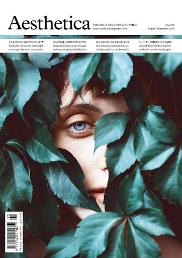
I will be using the article about maintaining a plant-based diet for my two-page spread because it directly correlates with the image of a dish from a food chain that creates alternatives to junk and fast food. The image of the vegetables in the table of contents would also relate to this article, and I have personal exposure with being vegan and relying on other foods, so this would be interesting for me to research on, as I am already involved in this topic.
As I finish up the table of contents photo edits, my next step would be to finally assemble the table of contents. Once that is completed, I will write my two-page spread and finally let the magazine come together. The end result will be something that goes against the super traditional conventions of a lifestyle magazine, while still displaying the same messages.
Comments
Post a Comment