Table of Contents Digital Mockups and Conventions Choices
In order to create these two mockups, I used the website Canva and inserted the elements in the places I thought were the best fit. The point of these mockups and layouts is to see how the placement looks and to alter it before the final information is added into the blank spots shown below.
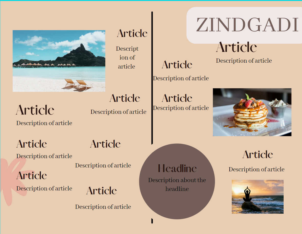
In this mockup of the table of contents, I followed the conventions of lifestyle magazines as I used a layout that is scattered and has information in a less organized manner. However, there are also elements of the list layout, where the articles are more organized and in a line, like on the left side, so this causes it to subvert parts of the conventions. The font choice in the layout is the same as the one used in the masthead on the cover, but the article titles and description of the articles utilize a different font in the same font family in order to not create abruptness in the spread. The magazine name is used in the top right corner, as this is common in lifestyle magazines, and it is not too big but it still creates a center of focus. The text is not very bold in order to create a contrast between the article name and the description under the titles. This color scheme is one that coincides with the one on the cover, using the brown color palette, and the images when actually taken will be filled with colors that do not collide with the browns. The larger article names will be the ones that have the image featured next to them, and those will be the potential articles for the two page spread.
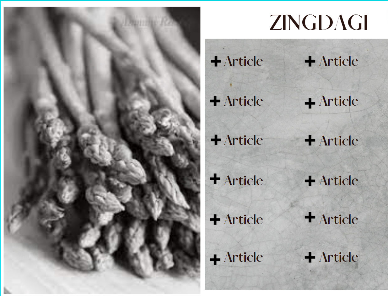
This layout of the table of contents fully follows the conventions of a lifestyle magazine because it exactly follows the list design that is used. There is also only one photo that will be used in this table of contents in a black and white color scheme, which is not common, so the color scheme subverts the traditional ways. The font choice in this layout is also the same, with a similar font to the ones used on the cover in order to create the idea that the magazine is cohesive and not using different themes for each page in the magazine. The size of the text is larger than the last layout in order to create a neat and clean list of the article titles and prevent the space from being too empty. The name of the magazine has the same idea as the last layout. Because the font is the same, the boldness is also the same, but the color of the text is balck, compared to the dark brown text in the last layout. There are not any descriptions under the articles in order to keep a clean black and white table of contents.
The main points for these layouts of the magazines are definitely the color schemes, because that's what separates these two table of contents the most, and the photos, which will relate to the main articles written in the magazine and possibly one that will be the two-page spread article. The next step is to fill out the elements, like the article names and the photos, with actual content to create a real table of contents.

Comments
Post a Comment