The Development of the Design and Layout of the Cover
INTRODUCTION
Many times, when one picks up a magazine it is easy to identify the genre it is. That may be because of the content, or simply the layout of the cover. The design/layout of a cover implies what the magazine will hold and what information they can receive from purchasing and reading this magazine. In this blog post, the beginning ideas to the formation of my magazine are shown, and how the cover will be laid out.
SKETCHES

In the photo shown on the left, there is a sketch of a potential design a lifestyle magazine cover may have. The main feature in this cover is an object, and it is a salad. The main image should imply the biggest topic that will be revealed in the magazine, and this lifestyle magazine is focusing on the idea of eating healthy and managing that type of diet. In order to not leave blandess on the cover, there will be more dishes and plates of food around it, but not too involved in the main image itself. The masthead is at the top of the magazine, as it is on most lifestyle magazines. I chose to put the masthead in front of the elements in the main image because it will create more emphasis to the viewer when they first see the magazine, therefore increasing the marketing image of the magazine brand itself. The cover lines are situated at the bottom of the magazine because of the empty room there to begin with, and to create a flow when the reader wants to view the entire cover and its contents without being overwhelmed with seeing so many things at once. Sell Lines are not common in the genre of lifestyle magazines, and were not included in this sketch because they are not in other lifestyle magazines. In the bottom right corner, there is the little rectangle for the barcode, as they are generally included in magazines.

In this sketch, the main image is a woman wearing a very elegant and large dress and an interesting, yet fashionable, hat. The entire scene is meant to be over exaggerated, and to show that the person on the cover has some type of importance and meaning. Because of the wide range of articles and magazines that can be released under the lifestyle genre, this magazine is focusing on fashion and going into the famous person on the cover’s life. The masthead is written using a subtle, lowercase font in order to not take away from the extravagant main image, but to still lead the viewer to see it. The main image is taken using the rule of thirds and is slightly off-center to create a more interesting scene and to show more of the dress and possibly explain the meaning of the dress in an article (a two-page spread) and who designed the dress. Again, the masthead is in the same place because lifestyle magazines do not place them elsewhere, like other genres of magazines do.The font for the coverlines is still lowercase and a variation of the font used in the masthead in order to create a cohesive cover and not include too many different fonts that can confuse the viewer. The barcode is on the other side compared to the first sketch, but there is still no sell line.
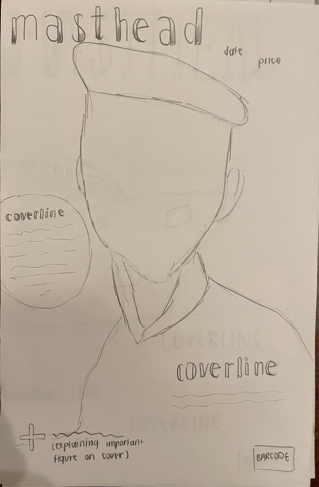
In this magazine design, the main image is a male model wearing a beret and a dress shirt. Because lifestyle magazines can be for men or for women, many companies aim to release magazines for both in order to increase sales and provide for a bigger audience. The masthead is a simple, lowercase font that has an ombre effect within the letters, as they are three-dimensional instead of not having any elements in the font. The masthead is also more in the corner instead of directly centered because the figure in the main image is on the right, so in order to create a flowing balance, the masthead was shifted in the opposite direction. The coverlines use the same font as the masthead in order to create unity within the cover and to surround the figure in the main image with ideas that the viewer will easily see. The use of the circle to explain an article in the magazine and its coverline is to emphasize that specific article and relate it to something of importance on the cover. The plus sign in the bottom left corner is to show who is on the cover and describe why they are involved in this issue of the lifestyle magazine. The date and price are in the top right corner in order to not leave too much negative space, but also not overwhelm the viewer by fitting everything into the corner. There is a rectangle in the bottom right corner for the barcode, as they are commonly on the cover of all magazines. The background behind the figure, coverlines, and masthead is one solid color depending on the color of the outfit worn by the figure and the colors of the fonts, in order to not take away from everything else shown.
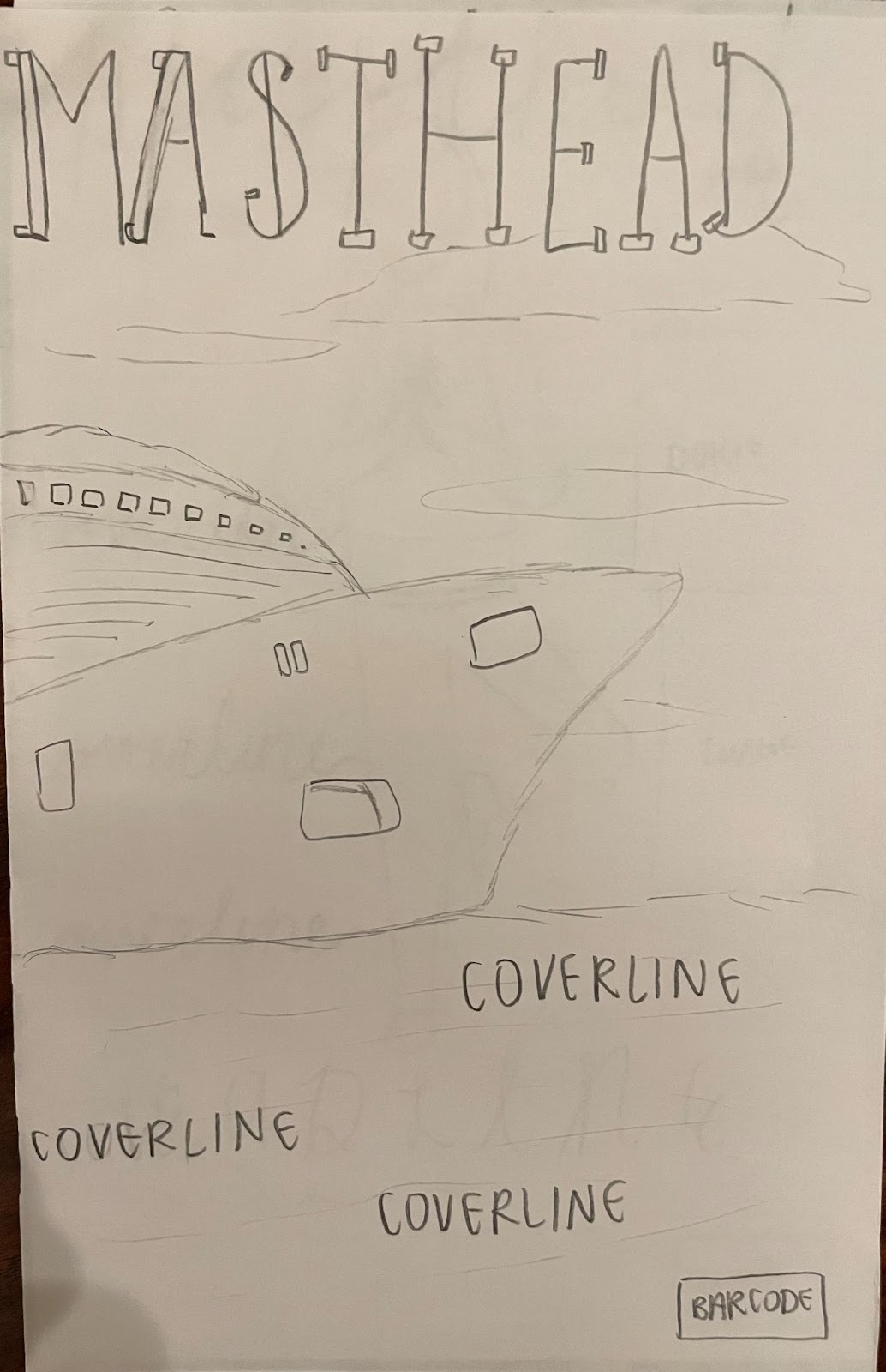
This sketch contains a mina image of a cruise ship and the blue waters it is traveling on. In the background of the cruise is the sky, along with clouds, that are also the background of the masthead. As stated previously, lifestyle magazines can have a variety of ideas that are presented in their magazines, so this specific lifestyle magazine is focusing on travel and tourism, while still containing articles about other lifestyle elements. The masthead is at the top of the page and is in front of the main image in order to still show the main image, and to show the title of the magazine to create a farmilaite to the audience in hopes that they will buy another issue. The cover lines are located in the “water”, or the bottom half of the main image in order to not take away from the image of the cruise, but to also not just leave the water looking boring and plain alone. The cover lines are not placed elsewhere because if they were surrounding the cruise ship, the top half of the magazine would be too full, while the bottom would be boring, therefore causing the audience to be confused on what they are looking at. The cruise is also not directly in the middle, in order to add movement to the image and make it look like the cruise is still in motion, not stationary and ordinary. There are no sell lines, but the barcode is located in the bottom left corner.

In the sketch presented on the left, there is a main image showing a woman meditating and doing yoga. In lifestyle magazines, mental health and the overall wellness of the body and mind are very prominent, so this certain issue is mainly talking about that. The masthead is written using a cursive font that is very calm and graceful, and this shows the idea present in the main image of being peaceful and taking time to reset and relax. The cover lines are also using the same font for the masthead to show the same meaning and create a cover that is visually appealing, but not too much to look at. The woman doing the yoga pose is directly in the middle because the viewer’s eyes should travel along the page after going to the main image first. The cover lines are placed on the left side of the woman, while the main article that relates to the cover image is displayed at the bottom, in a bigger font, in order to emphasize it more and make it the magazine’s selling point. There are two images located on the right of the figure to show what other important topics are included in the contents of the magazine, and to give the audience a teaser, but not fully disclose what the magazine will go into detail with to get people to buy the magazine. The barcode is again in the bottom right corner, as that's where it is most common in all magazines.
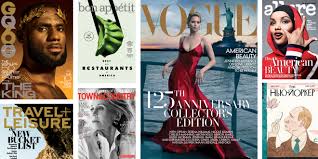
As shown in this collage of multiple lifestyle magazines, is the common elements that were explained with the sketches of new lifestyle magazines. Generally the masthead is at the top, whether it be behind or in front of the main image, and the main images are always relating to the biggest article and point that needs to be made.
I am leading to the first or third option for the layout of my magazine as they contain the most elements present in the genre of lifestyle magazines, while still carrying all the information and articles I would like to write about. To sum up, lifestyle magazines have characteristics that can create an elegant look that draws in a large audience of readers and informs them about how to live right and healthy, while unveiling other topics.
WORKS CITED
50 Magazine Cover Design Tips to Inspire You | CANVA. https://www.canva.com/learn/magazine-cover-design/.
Inspiration, Posted in, et al. “Fashion and Lifestyle Magazines Cover Design - 45 Examples.” Design Your Way, 27 Dec. 2018, https://www.designyourway.net/blog/inspiration/fashion-and-lifestyle-magazines-covers-45-examples/.
Lifestyle Magazine, https://lifestyle.org/.
Southern, Sophie. “How to Launch a Lifestyle Magazine.” Bizfluent, 11 Feb. 2019, https://bizfluent.com/how-7726695-launch-lifestyle-magazine.html.

Comments
Post a Comment