2-Page Spread Final Mockup and Choice Elaboration
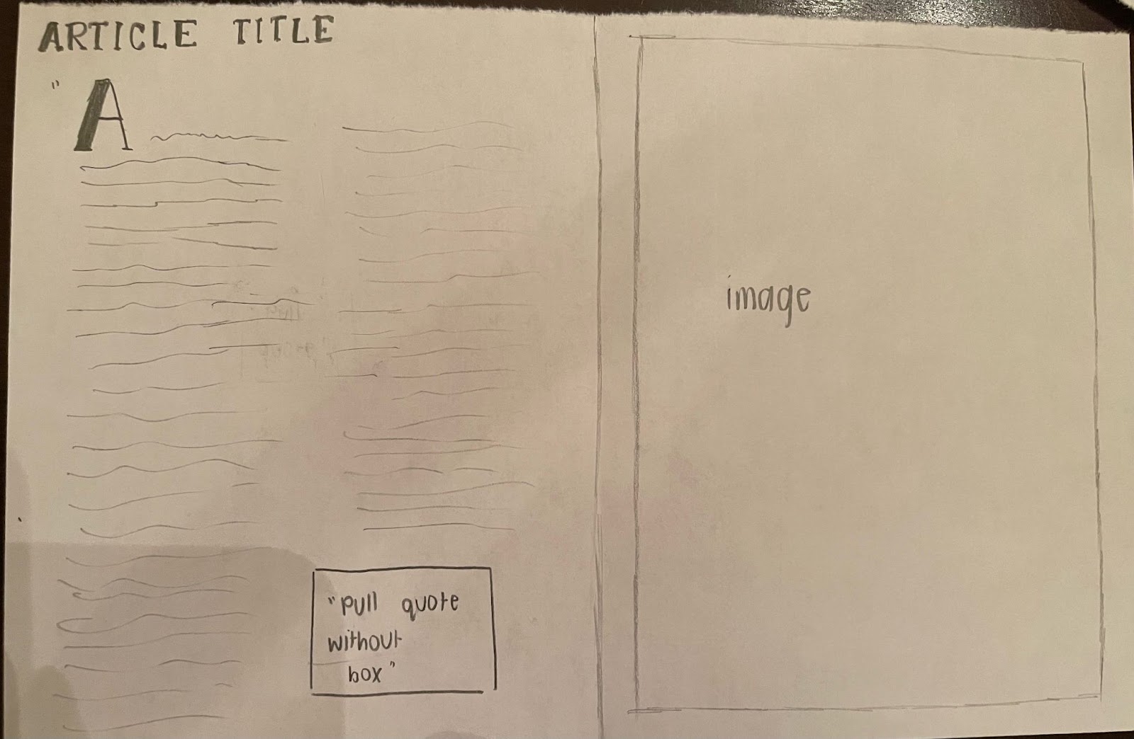
In order to create my final mock up for the 2-page spread article, I used one of the drawings I created for the layout, as shown in the last blog.
PRODUCTION PROCESS
The website Canva was utilized in order to create my spread because of how easy and accessible it is, and how simple it is to edit something I do not like the placement of.
To begin with, I created this background by first making half of the spread a dark blue by inserting a rectangle available in the Canva sticker section. I then added another rectangle from the small section, but edited the sizing of it in order to make it fit evenly and create margins that do not tighten the space.

After having the background done, I simply added my article into the spaces and made 4 columns of writing, as a traditional magazine article has. I used the green color font for the title in order to tie it back to the color of the photo, which is a photo of green foods, and to bring it into the color scheme. This combination of colors was chosen because it still has the ability to add the green elements from the photo, while still having the beige color which ties back to the colors used in the table of contents and the cover page of the magazine. I also added an original photo of plant-based foods at my local grocery store to connect the image to the contents of the article about diets based off of these foods. I chose this font for the article title because it is also used in the table of contents, so it creates familiarity and unity across the entire magazine. Furthermore, the font for the article itself and the byline is also utilized in the table of contents and cover page, which serves the same purpose.
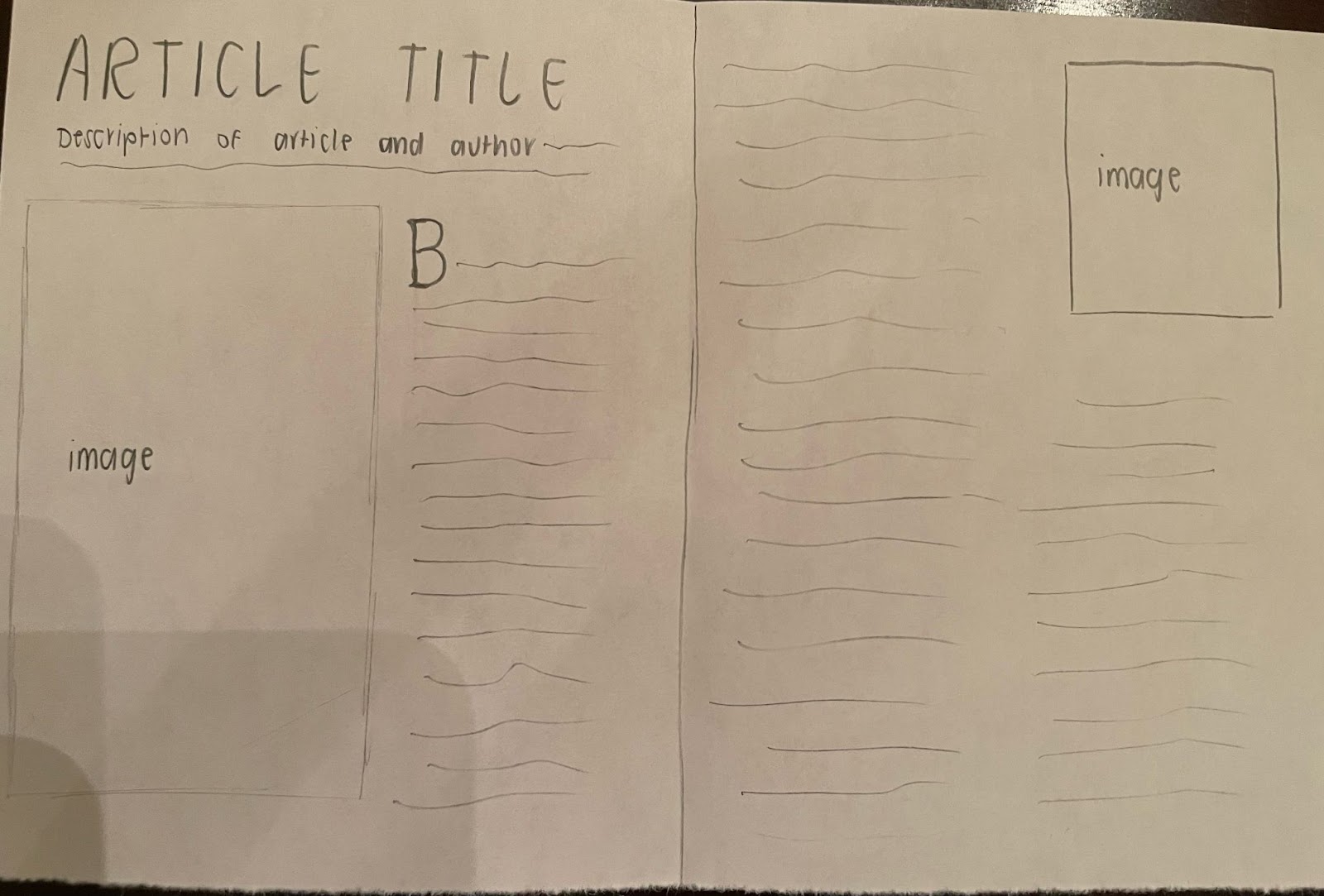
I slightly altered this layout shown above, as I did not include the drop cap that is included in the drawing. I left out the drop cap because there was less space on the 2-page spread to begin with, and I did not want to make the article longer than 2 pages because it would cause the viewer to have to flip the page in the middle of the article, which seems more abrupt. This purposely subverts the convention of lifestyle magazines, as well as the border with half of it being blue and the other half being white is also not common in this genre. The rest of the article is almost basic compared to other articles released by lifestyle magazines.
This final mockup of my two-page spread has elements that are carefully chosen in order to invite the audience to read this article and use it to possibly start a diet of their own!

Comments
Post a Comment