Planning and Formatting the 2-Page Spread
In order to create my two-page spread, I created some plans on paper and have already written my article.
CONTENT ON THE SPREAD
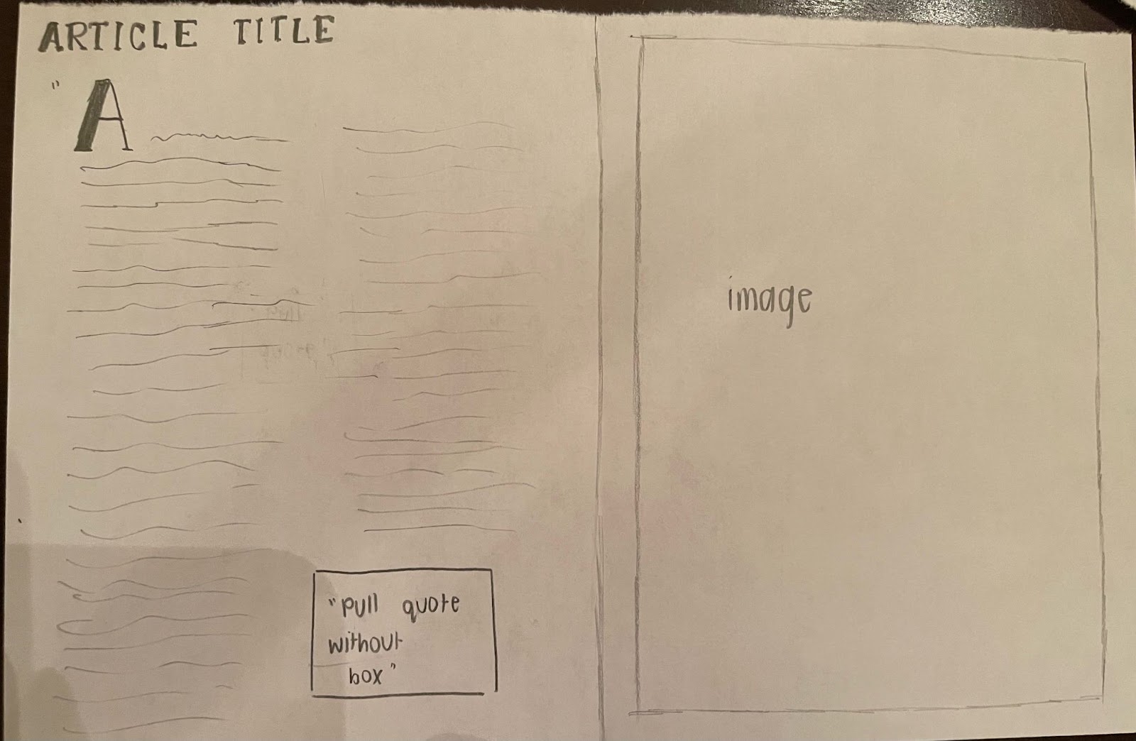
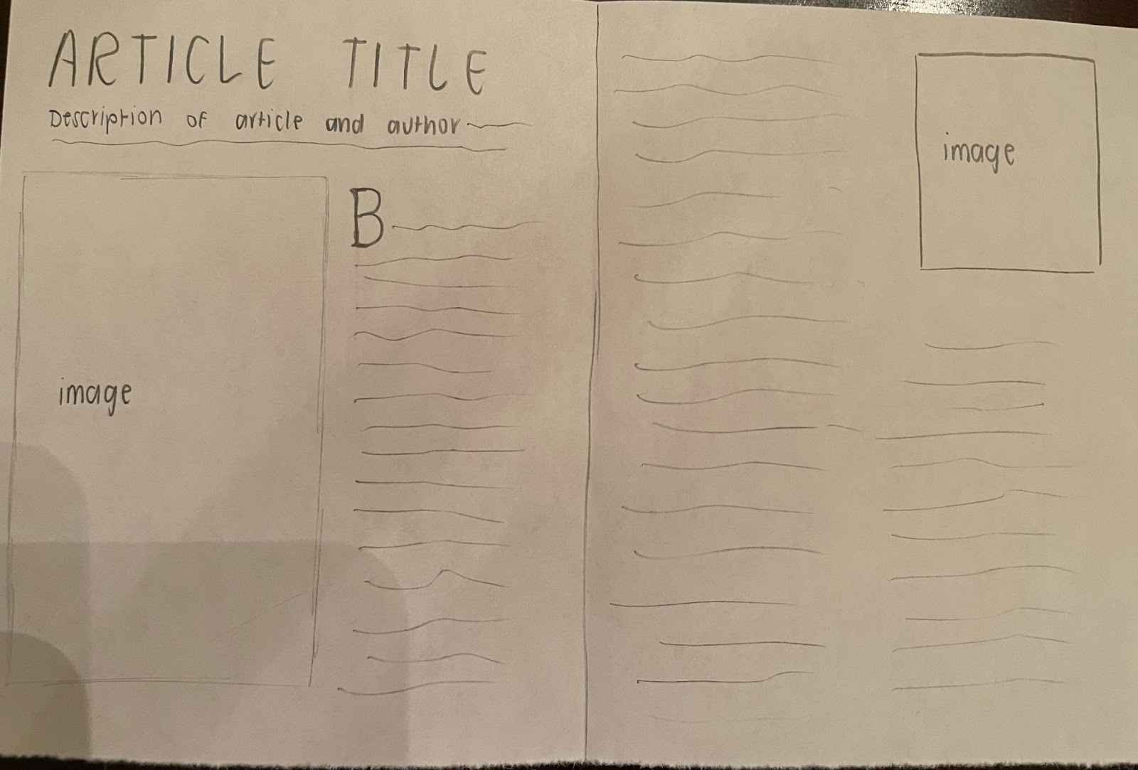
For the title of the article, I wanted to use “Plant Power”, and for the line underneath the title I wanted to explain what the article is about, so something like “Plant-based diets and why they are up and coming”. There can be some headings relating to the content. For example, “Tips to Start a Diet of Your Own” and “The Benefits”.
COLOR SCHEME
For the color scheme, I want to utilize a similar “vibe” as the table of contents and the cover page, which are more neutral tones instead of bright and loud colors. I want to use lighter shades of browns as the main focus, but also include some colors that are primary, such as red, blue, and yellow. These primary colors would be more mellow and mixed with more white to not cause an exaggerated contrast with the rest of the article and the other pages of the magazine.
PULL QUOTES
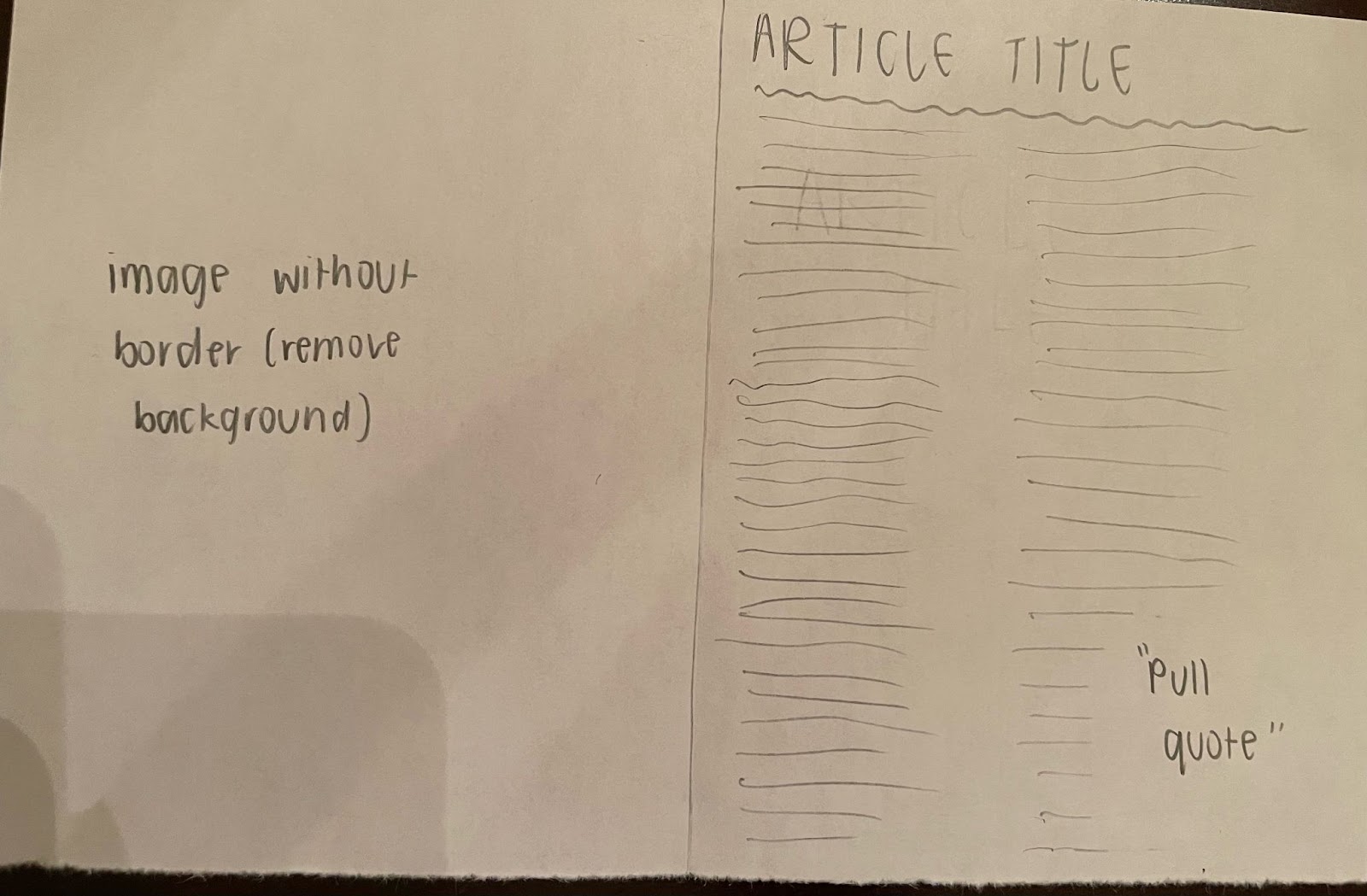
Only two of my mockup drawings for the article spread utilize pull quotes because they are not as common in lifestyle magazines, however, I think having them on the page filled with text allows for the viewer’s eyes to take a break and read something of importance in the middle of the article. By doing this, my article spread is purposely subverting the conventions of the lifestyle genre.
DROP CAP
Drop caps are extremely common in lifestyle magazines, and I would really like to include one in my article, but I left one of the spreads without a drop cap just to see how it fits and if it helps with the ideas I want to present in my article and images.
PAGE NUMBERS
Although they are not included in the mockup drawings, I would like the page numbers to remain in the bottom corner of the pages because they are in the easiest spot to recognize and are familiar to the audience member that could be searching for an article based on the page numbers listed in the table of contents.
FONT CHOICES
The font I would like to use for the body of the article is Playfair Display because it has light, medium, and heavy settings and it is a simplistic font that seems dainty and professional, and especially right for a lifestyle magazine. For the title, however, I would like to use a different font like Verdana or Oswald in order to create a contrast between the different types and ideas of text displayed on the pages.
IMAGES
Because my article focuses on plant-based diets, I need to include photos on healthy food and other plants. The photos should be based on “greens” and have a correlation with the content of the article and the idea of food that can relate to the restrictions of the diets.
LAYOUT OF THE SPREAD
For all these mockup drawings, the viewer can read the text from left to right and the text is in columns so it is meant to be read from up to down.

Comments
Post a Comment